More actions
Main article: Aggregation techniques
Trust/Probability/Population Graphs Algorithm U99
This algorithm is a variant of the trust-weighted histogram (TWH) algorithm and can be conceived of as follows. Start by plotting probability on the x-axis and trust on the y-axis for each source. Now draw lines to represent intervals in the x and y-axis (eg 0-0.2, 0.2-0.4, etc). Each rectangle (ie bin) in the resulting grid will contain some number of (probability, trust) points. Record the number of points in each rectangle. Average the points in each rectangle. This will result in a table of values representing (p_ave, t_ave, population). Graph this using a bubble plot where the population is the area of the bubble.
Let’s describe the algorithm in terms of the example we’ve been using so far:
HTTP-Response:
Error 400: Internal Server Error

Diagram-Code:
digraph G {
    fontname="Helvetica,Arial,sans-serif"
    node [fontname="Helvetica,Arial,sans-serif"]
    edge [fontname="Helvetica,Arial,sans-serif"]
    layout=dot
    1 [label="1, P=20%"]
    2 [label="2, P=30%"]
    3 [label="3, P=40%"]
    4 [label="4, P=45%"]
    5 [label="5, P=60%"]
    6 [label="6, P=90%"]
    7 [label="7, P=55%"]
    8 [label="8, P=65%"]
    9 [label="9, P=70%"]
    10 [label="10, P=80%"]
    1 -> 2 [label="T=0.9"];
    1 -> 3 [label="T=0.9"];
    1 -> 4 [label="T=0.9"];
    2 -> 5 [label="T=0.9"];
    2 -> 6 [label="T=0.9"];
    3 -> 7 [label="T=0.9"];
    3 -> 8 [label="T=0.9"];
    4 -> 9 [label="T=0.9"];
    4 -> 10 [label="T=0.9"];
    }
We start by choosing a number of bins for the probability (NPbins) and trust (NTbins). Let’s choose a very simple situation with 2 bins each. This means our grid is composed of 4 rectangles (total bins) where the x intervals are (0,0.5) and (0.5,1.0) and y intervals are the same.
Next we begin analyzing the tree by looking at Nodes 2,5,6 as usual. The probability, trust, population information for these nodes can be tabulated as follows:
| P | T | Pop |
|---|---|---|
| 0.3 | 1.0 | 1 |
| 0.6 | 0.9 | 1 |
| 0.9 | 0.9 | 1 |
We place each of these points into one of the 4 bins:
| P | T | Pop | Pbin | Tbin |
|---|---|---|---|---|
| 0.3 | 1.0 | 1 | 0.0-0.5 | 0.5-1.0 |
| 0.6 | 0.9 | 1 | 0.5-1.0 | 0.5-1.0 |
| 0.9 | 0.9 | 1 | 0.5-1.0 | 0.5-1.0 |
We see that the first row lies in it’s own bin and the next two rows are part of the same bin. We average the numbers in each bin:
| Pave | Tave | Pop |
|---|---|---|
| 0.3 | 1.0 | 1 |
| 0.75 | 0.9 | 2 |
This is the result for Nodes 2,5,6.
We do exactly the same thing for Nodes 3,7,8:
| P | T | Pop | Pbin | Tbin |
|---|---|---|---|---|
| 0.40 | 1.0 | 1 | 0-0.5 | 0.5-1.0 |
| 0.55 | 0.9 | 1 | 0.5-1.0 | 0.5-1.0 |
| 0.65 | 0.9 | 1 | 0.5-1.0 | 0.5-1.0 |
| Pave | Tave | Pop |
|---|---|---|
| 0.4 | 1.0 | 1 |
| 0.6 | 0.9 | 2 |
For nodes 4,9,10:
| P | T | Pop | Pbin | Tbin |
|---|---|---|---|---|
| 0.45 | 1.0 | 1 | 0.0-0.5 | 0.5-1.0 |
| 0.70 | 0.9 | 1 | 0.5-1.0 | 0.5-1.0 |
| 0.80 | 0.9 | 1 | 0.5-1.0 | 0.5-1.0 |
| Pave | Tave | Pop |
|---|---|---|
| 0.45 | 1.0 | 1 |
| 0.75 | 0.9 | 1 |
Now we can level up to Node 1 with the results of Nodes 2,3,4. The trust is multiplied by the trust that Node 1 has for it’s children (0.9) in each case.
| P | T | Pop | Pbin | Tbin |
|---|---|---|---|---|
| 0.2 | 1.0 | 1 | 0.0-0.5 | 0.5-1.0 |
| 0.3 | 0.9 | 1 | 0.0-0.5 | 0.5-1.0 |
| 0.75 | 0.81 | 2 | 0.5-1.0 | 0.5-1.0 |
| 0.4 | 0.9 | 1 | 0.0-0.5 | 0.5-1.0 |
| 0.6 | 0.81 | 2 | 0.5-1.0 | 0.5-1.0 |
| 0.45 | 0.9 | 1 | 0.0-0.5 | 0.5-1.0 |
| 0.75 | 0.81 | 2 | 0.5-1.0 | 0.5-1.0 |
We can sort these values according to the bin they are in, separating each bin with a space:
| P | T | Pop | Pbin | Tbin |
|---|---|---|---|---|
| 0.2 | 1.0 | 1 | 0.0-0.5 | 0.5-1.0 |
| 0.3 | 0.9 | 1 | 0.0-0.5 | 0.5-1.0 |
| 0.4 | 0.9 | 1 | 0.0-0.5 | 0.5-1.0 |
| 0.45 | 0.9 | 1 | 0.0-0.5 | 0.5-1.0 |
| 0.75 | 0.81 | 2 | 0.5-1.0 | 0.5-1.0 |
| 0.6 | 0.81 | 2 | 0.5-1.0 | 0.5-1.0 |
| 0.75 | 0.81 | 2 | 0.5-1.0 | 0.5-1.0 |
We now average the values in each bin, weighting each value by its population:
| Pave | Tave | Pop |
|---|---|---|
| 0.3375 | 0.925 | 4 |
| 0.7 | 0.81 | 6 |
For example, to calculate for the 2nd bin:
Although this calculation illustrates how population weighting the average works, it isn’t really necessary because all the inputs happen to have the same population in this case.
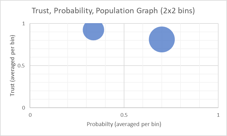
The resulting graph appears as follows:
The graph is not interesting given the small number of sources and the most simplistic binning possible. It only shows a slightly higher number of sources having a positive answer to the question (above 50%) and that this answer is slightly lower in trust, reflecting its attenuated nature (farther down the tree).
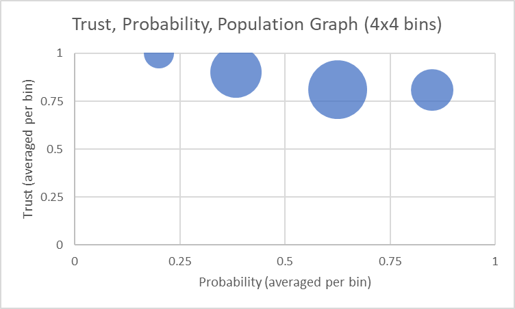
If we use 4 intervals in the x and y-axis, splitting at each 0.25 we obtain 16 bins. The results of this is plotted as follows:
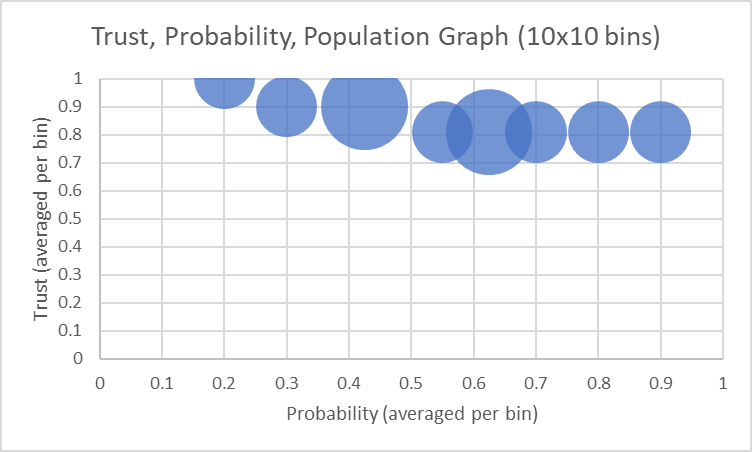
And if we use 10 intervals on each axis,
This is in essence the same information plotted by Eric in describing the TWH algorithm.
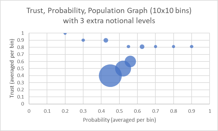
The sample size here was small for illustrative purposes but let’s assume we have a much larger population further down the tree. If each node has two children then the tree above will have 12 nodes with one level further down, 24 the next, and 48 the next. These populations overwhelm our close associates and may have a different opinion, eg,
This is intended to show a larger population (further away from the head node) converging toward a lower opinion than held by head node’s closest associates. The graphs shown here can be accessed in the following Excel spreadsheet: Bubble.xlsx
Discussion of the algorithm
The idea of this algorithm is to see at a glance prevailing views and patterns in the data for what is presumably a larger population. In such a case we’d want to know what people think in terms of probability, our level of trust for those probabilities, and the number of people who believe in each particular probability outcome. Think of it as survey data with a few more bells and whistles.
The population grows exponentially the farther down the tree we get but trust also becomes more attenuated as we do this. If a prevailing view is to be found “among the masses” it may well be of low trust. The graph allows us to see this phenomenon, however, because such a population would be represented with a large bubble so the user will know at a glance that the low trust is probably due to attenuation. Along these lines, it should be noted that the difference between “judgement trust” and “communication trust” as outlined in this previous post should be clear. The immediate parent can impose a “judgement trust” on its child for the answer it provides, but all its communicated answers should be based on the “communication trust”. We presume in the examples above that this idea is being adhered to although there is no notion in the software of a distinction in trust types.
Like the THW algorithm, this one does not modify the probabilities with trust. The displayed probabilities are the “raw” probabilities as reported by the sources. Thus, no distortion of probability information is generated, which is especially important if trust is low or has been attenuated to a low value because the population of interest is several levels deep. Also, trust is plotted on the y-axis which is similar, in a sense, to the TWH y-axis. However, TWH’s y-axis combines trust with population and this one keeps them separate.
In terms of the interface, no new entries needed to be created, although we did have to stretch the meaning of the pdf_points in OpinionData (ie opinion.pdf_points), since this now includes not only the probability but also the trust and the population information:
Trust Probability Population Graph Overall output1234 = [[[[0.3375, 0.9249999999999999], 4.0], [[0.7000000000000001, 0.81], 6.0]], [[[0.6625000000000001, 0.9249999999999999], 4.0], [[0.3, 0.81], 6.0]]]
Also, although opinion.pdf_points contains all the information we need to create the graph of interest, we might consider the creation of a separate output that contains just the data we want to graph, such that a spreadsheet or 3rd party tool can easily interpret the data as x, y, z points. A PrintGraphablePoints is shown in the snippet to make it convenient to copy and paste the points into a spreadsheet. Our software, of course, will probably have its own graphics package built in, removing perhaps the need for such tools.
Along these lines, we might consider the development of an API that helps users develop their own algorithms. An algorithm that encompasses multiple answers (not just predicates) and is suitable for multi-level calculations (where we need intermediate_results) can cause multiply nested lists or arrays (as we’ve seen) which could be difficult for users to create. Having a package of helper functions may alleviate this. As algorithms develop it is possible that such a set of functions will emerge.


